


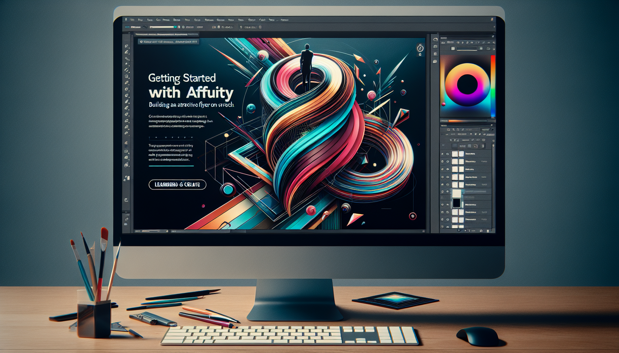
www.alliance2k.org – Context is the secret ingredient that separates a forgettable flyer from one that stops people in their tracks. When you understand context, every color, shape, and word in your Affinity layout supports a clear message instead of just filling space. The new members-only CreativePro Network video on getting started with Affinity leans heavily on this idea, guiding you through each decision with practical context instead of abstract theory.
Rather than tossing tools at you, the session builds context step by step: who the flyer is for, where it will appear, and how each design choice supports that reality. In this article, we will unpack that approach, explore why context matters so much in Affinity, and add personal insights to help you create stronger, more intentional designs from scratch.
Why Context Matters Before You Click Anything
Many beginners fire up Affinity and immediately start dragging shapes, testing fonts, or pouring in images. That playful energy helps, yet without context you end up polishing random experiments instead of building a focused flyer. Context gives you a compass. It clarifies the goal, the audience, and the environment where your design must work, so every click has a reason behind it.
Think about a flyer for a neighborhood art fair. Context includes the venue, timing, expected visitors, printing method, and even weather. A glossy, high-contrast layout might look great on screen but could feel out of place taped to a community notice board. When context shapes decisions, style becomes a servant to clarity, not a distraction from it.
The members-only video emphasizes this early stage with quiet intent. Before diving into tool palettes, the instructor frames the scenario behind the flyer. That narrative context turns each later move—margins, grid, color selection—into a logical response instead of a guess. You are not just learning software; you are learning how design lives in real situations.
Building a Flyer Layout With Context at Every Step
Once context has been defined, Affinity becomes far less intimidating. The first structural task often involves the document setup. Page size, margins, and bleed are not just technical checkboxes; they reflect where the flyer will be printed, how it will be trimmed, and how much white space feels appropriate in context. For a handout slipped into folders, generous margins might read as sophisticated. For a bulletin-board poster, a bolder, edge-to-edge look could be more visible.
Next comes hierarchy. The video demonstrates how context shapes the visual pecking order: headline, subhead, event details, call to action. If you expect people to glance at the flyer from several steps away, the headline must carry clear meaning even when text cannot be fully read. That awareness nudges you toward strong, contextual language and typography choices. Serif or sans serif, condensed or extended, heavy or light—all filtered through how viewers will actually encounter the piece.
Imagery follows the same logic. A flyer for a jazz night in a small bar has a very different visual context than a flyer for a kids’ science workshop. In the tutorial, each image is evaluated through that lens. Is it legible at the final size? Does it compete with the event title? Does the mood match the story? Affinity’s adjustment layers, cropping tools, and blend modes become instruments used to tune the image so it fits the contextual soundtrack instead of shouting over it.
Color, Type, and Context-Driven Consistency
Color and typography often tempt designers to chase trends, yet context should anchor those choices. Within Affinity, the video shows how to build a palette that respects brand colors or event personality instead of defaulting to whatever looks flashy. You see how subtle tweaks—slightly muting a background hue, adjusting line spacing, refining letter spacing—can improve readability for actual viewing conditions. My own perspective aligns strongly with this: a flyer succeeds when its context-driven system feels invisible, because everything simply works. Affinity gives you precision, but context tells you when to stop adjusting. When both align, you move from decorating to communicating.
Context as a Teaching Lens in Members-Only Training
Beyond the flyer itself, the video uses context as a teaching strategy. Every new Affinity feature appears exactly when it becomes relevant, not as an isolated lecture. That mirrors how designers really learn software. You encounter a problem—misaligned text, dull image, overloaded layout—then explore tools that solve it in context. This method respects your attention, because each demonstration has a visible payoff on the page.
For example, when working with text frames, the instructor does not just list options. Instead, they show a crowded block of details, ask how this might read on a busy bulletin board, then adjust line spacing, column width, and alignment right there. You experience the way context drives edits. The software becomes more intuitive because you remember why a setting matters, not only where it lives in a menu.
As someone who has watched countless tutorials, I find this contextual teaching especially effective. Purely tool-focused videos often feel like touring a hardware store without a project. This members-only approach hands you an actual design problem, then introduces Affinity features as specific answers. You walk away with both conceptual understanding and muscle memory rooted in real scenarios.
From Blank Page Anxiety to Context-Guided Confidence
One of the biggest hurdles for newcomers is the fear of the empty canvas. Affinity opens with a stark white page, and that emptiness can create paralysis. Context helps dismantle that anxiety. When you start with a clear description of the event, the audience, and the distribution method, the blank page does not feel empty anymore. It becomes a space reserved for a specific story that you already know.
The tutorial highlights this psychological shift by narrating each early move with purpose. Setting a grid is not busywork; it reflects how your audience scans information. Choosing a column structure is not arbitrary; it connects to how much text you must include. This running commentary about context lowers the stakes. You are no longer guessing; you are translating known constraints into visual form.
Personally, I think this might be the most underrated benefit of context-focused training. Once you internalize this way of thinking, every new project in Affinity starts smoother. Instead of hunting for inspiration at random, you interrogate context first: What must people remember? Where will they see this? How much time will they have to read? Those answers automatically suggest layout strategies, even when inspiration feels distant.
Using Context to Avoid Common Beginner Mistakes
New designers often overload flyers with text, conflicting fonts, or unrelated images. Context provides a filter that prevents those missteps. The members-only video models this by asking, again and again, whether each element earns its place based on real-world use. If a detail will not influence attendance, it gets trimmed. If a decorative flourish hurts readability from a distance, it gets simplified. My own view echoes that discipline: creative freedom flourishes when you respect constraints rather than fight them. By embracing context inside Affinity, you train your eye to design with intention, not impulse, and your flyers begin to feel calmer, clearer, and far more effective.
Context Beyond One Flyer: Growing as a Designer
The power of this training does not end when the flyer is finished. Once you grasp how context shaped each decision, you can carry that mindset into logos, brochures, social posts, and presentation slides. Affinity becomes a flexible companion for many mediums, while context remains your constant guide. That continuity turns scattered tips into a coherent design practice.
From a growth perspective, this is crucial. Software updates, features evolve, interfaces change. Context stays stable. An understanding of audience behavior, reading patterns, and environmental constraints still applies, no matter how many buttons Affinity adds. Members-only content that foregrounds context, rather than just features, future-proofs your learning because you develop judgment, not just technique.
Reflecting on the broader CreativePro Network ecosystem, this focus on contextual thinking fits a wider movement. Serious creatives do not just want shortcuts; they want frameworks. A flyer tutorial becomes more than a one-off lesson. It acts as a miniature lab where you watch context, content, and craft interact. Over time, patterns emerge, and you start anticipating what will work before you even drag the first text frame.
My Take: Why Context-Focused Learning Feels Different
I have seen plenty of tutorials where the final design looks polished, yet the reasoning behind it stays vague. You can copy the steps, but when you face a different project, you feel lost again. Context-focused instruction has the opposite effect. You might not remember every technical move, but you remember why decisions happened. That memory helps you improvise when your next flyer has fewer images, more sponsors, or a different size.
In this sense, the members-only Affinity video resembles a design critique embedded inside a demo. You watch not only what the instructor does, but also how they weigh options based on context. When they choose a quieter color for event details or push the call to action higher on the page, you learn to see through their eyes. That kind of insight is hard to gain from static tutorials or disconnected tips.
From my perspective, this design-with-context approach also respects your individuality. Instead of prescribing a single style, it hands you a decision-making lens. Two designers could follow the same principles and produce very different flyers, both effective in their own context. That flexibility lets you find your own visual voice while still grounding your work in solid reasoning.
A Reflective Closing on Context and Creative Growth
In the end, the most valuable lesson from this members-only Affinity training is simple: context turns software skills into communication skills. By constantly asking where, who, why, and how, you design flyers that do more than look attractive—they function. They guide eyes, support memory, and respect real conditions. As you carry that mindset into other projects, Affinity becomes less a toolbox and more a fluent language. Reflecting on your own work through this lens may feel challenging at first, yet over time it builds quiet confidence. You know your choices mean something, anchored in context rather than trend, and that awareness is where genuine creative growth begins.